Saturday 14 May 2011
Friday 13 May 2011
Final layout
Monday 9 May 2011
icons
Monday 25 April 2011
Wednesday 13 April 2011
Online presence
For my online presence i use three links to other sites.
Linkedin, Twitter and Flickr. I have chosen Linkedin and Flickr ue to their professional appearance so hopefully this will further help create my online presence. I have chosen twitter because of being more social but this still helps with job finding etc as its quite big on their.
Tuesday 1 March 2011
Browns design
These are screens from the Browns design website, they're are a design agency.
I really liked the photgraphical approach to there home page, and i'm assuming it changes from time to time with there newsletter thing that comes out. the Browns paper. and although some screens suited the rest of the site, the work pages seemed like they were separate to the rest of the website since they had a white background.
Wednesday 23 February 2011
Friday 18 February 2011
http://www.ilovedust.com/projects/by/type
Another simple themed website, which i thinked worked very well, the visuals were in the style of his work and worked well together. The layout is quite basic but works well with the amount of work he had, although i thought a lot of scrolling was involved when going to the bottom of the page i think this could of been tackled with smaller icons and displaying more per row. The large icons can be distracting though and took me a few seconds to find the navigation buttons. Again i tihnk smaller icons or even slightly larger nav buttons or side placed nav buttons would of delt with this.
http://www.iainclaridge.co.uk/studio/portfolio
This is the portfolio of another graphic designer called Iain Claridge At first glance it lookd abit jumbled with things not quite in check, and at second glance it still does. menus, buttons and links seem to be a bit out of place. i did like each thing about his site when i looked at them individually. The highlight over the page links was a nice touch especially since it was verty responsive and quick, i also liked the hover over on the images, the overall simplcity and coloursceme worked well.
Thursday 17 February 2011
This is an early idea i have had, this would be msotly photographic, using them as links instead of traditional text, ie a photo of a phone or my phone will be for contact details. and a picture of my portfolio will represent my portfolio section, these main icons would remain at the side of the screen allowing the rest of the page to display the information requested. This is as far as i've thought into this yet but its just an idea.
Initial thoughts about my site
I would like to produce a portfolio based website containing images of my work possibly photographed versions. (digital version could also be included?) the rest of my site will contain my cv both online and a downloadable pdf of it. contact details and an about me section would also be included as well as links to things such as twitter etc. I want to avoid clutter on my site as well as a splah page as these annoy me for some reason.
Another site map
Saturday 12 February 2011
http://www.marcdahmen.de/
This is an online portfolio for an architect designer. It opens up with an interesting splah page however i'm not normally a fan of these due to it just meaning more clicks and load time. i did like this, but as usual it let its self down by opening up the home page of the site in a new tab.
The overall colour scheme works well and the layout of his work is great being to even jumble them about with a refresh looking button.i thought it brought his work up too small as it was just a small presententation style and being able to navigate with the keyboard was convenient and different.
The rest of the buttons and lilnks on the page felt a bit left out and forgotten being very small and a similar colour to the background. He had won lots of awards and these were'nt very noticable. Maybe he's just being modest though.
Wednesday 9 February 2011
Tuesday 8 February 2011
http://www.dannyhaines.com/url/
This is someones personal online database of graphic designers, portfolios, graphic design studios etc.
First impressions i was slightly confused as the name of the site suggested a portfolio style website. The actual layout of the site is very clean cut and neat throughout the entire site. Largely a typographic based website the font choice is very good for this style, i did notice a slight kerning error on the Zz at the end of the list. I only noticed two bits of colour on the site at the top, although i agree with the choice of colour i couldn't help but think if he forgot to apply colour to other parts of the site or if just these two small parts are intentional
http://www.posttypography.com/site/index.php?action=portfolio&tid=11&iid=727
Another simple portfolio layout/template. The interesting thing about this site i thought was the navigation section. more tabs appear/dissappear depending on how much work or further links there are. However these just carry on and seemlessly blend into the rest of the permanent buttons, they differ slightly in colour, which allows the viewer to differenciate the work links from permenent ones. I though the simplcity and grey colour sceme allowed his work to really stand out in the quite large area supplied for it. Whilst the different colours in the navigation buttons which appear give a sense of the style of colourful work he produces.
A strange page on his site which the only link is his personel manifesto.
Monday 7 February 2011
http://www.designbymusic.com/work
This portfolio site had a rather interesting and for me a unique way of displaying pages previously visited by striking though the links clicked on, i found this to be confusing at first thinking "why have they got a strike through them?", and then clicking on them thinking theres something special going on here.
the way the work is displayed is also fairly different compared to a lot of people's portfolio websites. as it is esssentially a giant picture and the links take you to the specified area of the image which has hovered over.
I thought the rest of the information on the website e.g contact information were'nt displayed clearly enough and blended into the side of the screen.
overall i thought it made an interesting change to traditional layouts of portfolio websites although name of the site was abit misleading to start of with.
I think this image is a good example of how bad the text over his images can get.
Saturday 5 February 2011
http://mattsoncreative.com/#/home
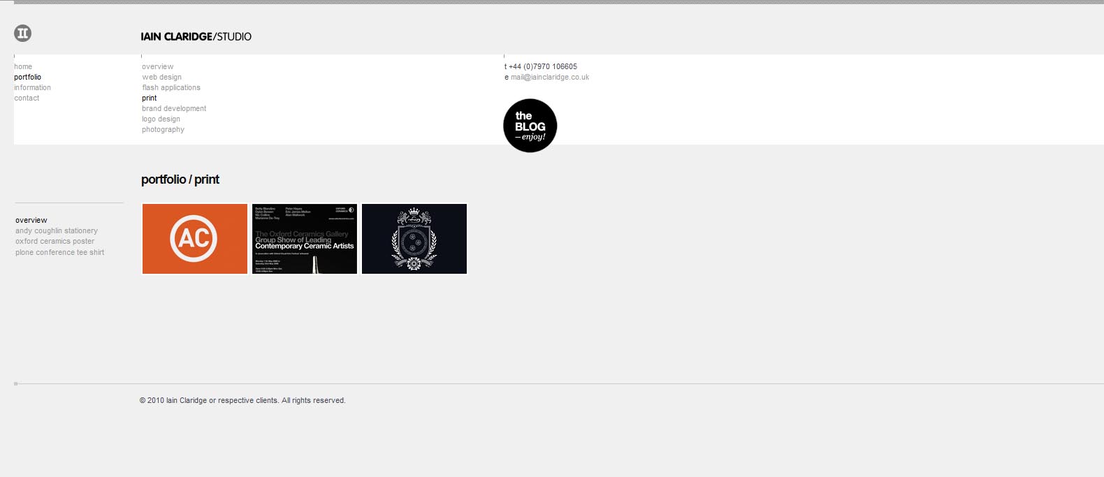
Very visually simple layout website. I found that the main benefit of this style of website allowed it to load very quickly and navigation is easy. This minimalist approach also gave off a certain professional vibe from the site before viewing the work. i thought this as a good/bad thing, it showed off his corparate logo and identity side of his work well, yet didn't do any justice to his illustrative side to his work. which i felt was more unique to him.
In terms of layout everything is clearly labeled and on the left hand side were most navigation links are placed. I think this website was great to use and left a good impression and the load times allowed me to view work quickly, however the particular style didn't allow his illustrative style to show in the first impression.
Subscribe to:
Posts (Atom)